

实现代码
<html>
<style>
.chk-container {
  display: inline-block;
  position: relative;
  cursor: pointer;
  font-size: 12px;
}

/* Hide the default checkbox */
.chk-container input {
  visibility: hidden;
  cursor: pointer;
}

/* Create a custom checkbox */
.chk-container .mark {
  position: absolute;
  top: 0;
  left: 0;
  height: 12px;
  width: 12px;
  background-color: lightgray;
}

.chk-container:hover input ~ .mark {
  background-color: #999;
}

.chk-container input:checked ~ .mark {
  background-color: #4285F4;
}

/* Create the mark/indicator (hidden when not checked) */
.chk-container .mark:after {
  content: "";
  position: absolute;
  display: none;
}

/* Show the mark when checked */
.chk-container input:checked ~ .mark:after {
  display: block;
}

/* Style the mark/indicator */
.chk-container .mark:after {
  left: 4px;
  top: 2px;
  width: 3px;
  height: 6px;
  border: solid white;
  border-width: 0 1px 1px 0;
  transform: rotate(45deg);
}
</style>
<body>
<div>


  <label class="container">
    <input type="checkbox" checked="check">
    <span class="mark"></span>
  </label>
  <a>test</a>
</div>
</body>
</html>
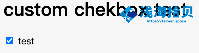
效果如下
 文章源自浅海拾贝-https://blog.terwergreen.com/customize-a-checkbox-that-can-modify-the-background-and-style-z1arbwh.html
相关文章
- 扫码加我微信
- 验证消息请输入:来自你的博客
-

- 我的微信公众号
- 微信扫一扫与我交流吧
-

评论